In our series “Maps and mappers of the 2016 calendar” we will present throughout 2016 the mapmakers who submitted their creations for inclusion in the 2016 GeoHipster calendar.
***
Kenneth Field
Q: Tell us about yourself.
A: I tend to call myself a professional cartonerd having never had a job with the word ‘cartographer’ in it. I have a Bachelors in cartography and PhD in GIS and spent 20 years in academia the UK. I was Course Director for GIS programmes at Kingston University in London and did all the usual academic stuff of research, teaching, supervising students, publishing etc. I’ve been privileged to have won a few awards for my maps, writings about maps and interior design (kitchen tiles!). I recently ended a 9-year stint as Editor of The Cartographic Journal and I’m currently Chair of the ICA Map Design Commission. I also co-founded The Journal of Maps, and am on the advisory board for the International Journal of Cartography.
I got totally frustrated by the admin-heavy bureaucratic nonsense of University life and moved to the dArc Side in 2011 to work with Esri to support high quality cartography and help develop the next generation of tools to support more intuitive, better map-making. That involved moving from the UK to California which is a switch I can heartily recommend. I’ve been called a ‘cartographer in residence’ though that implies some sort of temporary job which I hope isn’t the case. It’s a terrific place to work and I have so much freedom to experiment and push the boundaries of what’s possible in cartography.
I’m an advocate for high quality cartography and deliver keynotes, workshops, training and research support internationally and on the conference circuit. I blog about the good, the bad and the ugly under various guises (blogs.esri.com, cartonerd.com and mapdesign.icaci.org), tweet far too much (@kennethfield) and sometimes I make maps (carto.maps.arcgis.com). I’m currently writing a book on cartography with Damien Saunder which we hope will be out by the end of the year– the more I publicize that, the more I am committed to getting it finished! More than anything I’m passionate about encouraging and helping others make better maps through identifying and sharing best practices (and explaining cartofails).
I can also be found on a snowboard, in a pair of hiking boots, behind a drum kit, or supporting my once great football team Nottingham Forest.
Q: Tell us the story behind your map (what inspired you to make it, what did you learn while making it, or any other aspects of the map or its creation you would like people to know).
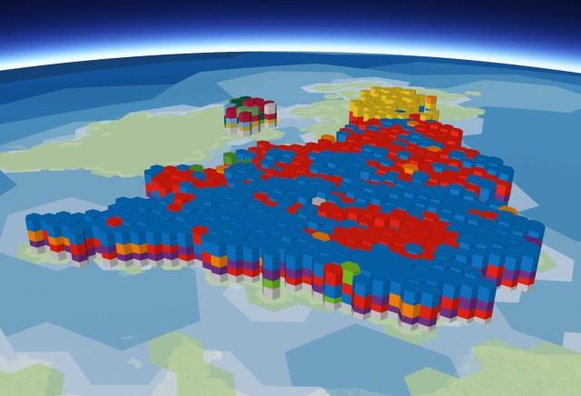
A: I tend to make thematic maps. I’ve always been skeptical about 3D thematic cartography and often struggle to find a compelling reason to switch from a planimetric map. The key, for me, is to use that third z dimension for something really useful and not just for the sake of making a glitzy map. As technology has improved to overcome many of the failings of static 3D cartography (fixed point of view, occlusions, labelling, etc.) I figured it was time to experiment. The 2015 General Election in the United Kingdom gave me the excuse I needed. It’s an online map, called Political Causeway, which you can view here (use Firefox or Chrome).

The challenge of trying to display results for 650 irregularly shaped and sized constituencies in the UK has spawned many different outcomes. Maps that show geographical constituency boundaries face the challenge of trying to accommodate distortions arising from the simultaneous display of visually incomparable areas. People are disproportionately distributed across space, and while constituencies attempt to iron this out for voting it creates a cartographic problem. After Danny Dorling’s innovative work on the development of cartograms for elections, we’re seeing increased use, particularly of hexagons, for political cartography. Of course, using hexagons as a data-binning technique can be traced back to the mid-1800s, but they are the very essence of carto-hipsterism. Equal-area and tessellated hexagons provide a good visual structure that also allows a reasonable amount of adjacency topology to be incorporated. They are abstract but ultimately a good visual way to display election results.
And why 3D? Partly the technical challenge, but also the structure of the voting meant I could use separate layers on the map to encode different aspects of the vote — with winners sitting on top and other political parties being represented in a second-place layer, third-place layer and so on.
For the 2015 UK election, virtually every media organisation used some sort of hexagonal cartogram (I wrote a blog on it here). As a fan of cartograms I also wanted to use hexagons, but I also wanted a challenge: to develop a three-dimensional hexagonal cartogram on a spherical virtual globe… and make it make sense. The map was inspired by a picture of David Cameron visiting the Giant’s Causeway in Northern Ireland taken in 2013. Hexagonal mapping and political photo-opportunities collided and my map idea was born. The map went on to win the Google Award for UK election mapping at the 2015 British Cartographic Society Annual Symposium.
Q: Tell us about the tools, data, etc., you used to make the map.
A: The map was designed and produced as part of my work at Esri. I always attempt to challenge conventional thinking while building maps that are heavily informed by cartographic concept and theory. Sometimes this requires us to think outside the box, break rules, and bring new ideas to the table. It’s an exciting area to be involved with — marrying creativity with new technology to create innovative and interesting cartographic products.
In two-dimensional space the creation of equal area tessellated hexagons is relatively simple. Creating hexagons that curve across a surface is more complicated due to the geometry involved. The initial challenge was to build a set of hexagonal regions that partition the Earth’s surface. This was achieved computationally by creating an icosahedral discrete global grid. A number of grids of different resolutions were built and used in different ways in the final map. I used Kevin Sahr’s excellent DGGRID program to generate the grids — the key being that to wrap a hexagonal mesh around the globe the overall mesh has to include occasional pentagons else the tessellation wouldn’t work. Think of a football (a.k.a. soccer ball).
Once general grids had been developed, they were further processed to build a grid of 650 tessellating hexagons covering the UK. The Election results were manually collated during the live television coverage and entered into a spreadsheet, then processed into formats to support the creation of different layers in the final map. ArcGIS Pro was used to build a layer of three-dimensional extruded hexagonal polygons for each of four layers representing the winners, runners-up, third place, and also-rans (others). I’m calling them hexstones. Each hexstone in each layer was extruded proportionally to the candidate’s number of votes giving a causeway-like 3D surface and volumetric blocks. The base heights for each layer were modified so each layer sits relative to the layer beneath to build up the final three-dimensional political causeway. The model ultimately looks like a way of viewing the stratification of the election results a little like we might cut away layers of geological structure to see beneath. I liked the way this supports the causeway metaphor beyond simply the hexagonal shapes.
One of the limitations of any three-dimensional map of prisms (of whatever shape) is the inability to look ‘inside’. This is overcome through interactivity in the final map, but I also created a capstone for each constituency that shows the share of vote for the same four layers of results but in a single layer. This provides a way of seeing the political pattern of voting across all candidates across the top of the hexstones. It also allows the map to be viewed from above and reveal more than just the winners. At least — that’s the idea.
A range of supporting datasets (a custom 2D base map of hexagonal patterns, 3D leader lines, 3D labels, a 3D legend and pop-ups) were produced to support the final map, so it becomes something to explore rather than just look at and expect everything to magically happen for you. Interaction in a 3D environment is absolutely critical.
The map was published from ArcGIS Pro to Portal for ArcGIS into a 3D Web Scene which takes advantage of the 3D capabilities of WebGL browsers. The map must therefore be viewed in either Google Chrome or Firefox. The published web scene layers were configured to build the final map. The icosahedral global grid data was used to create a custom hexagonal basemap of different resolutions to create an abstract world map. Using a standard map of real global geography would not have suited the abstract 3D cartogram. A little transparency allows an imagery layer to bleed through, giving just a hint of a real world. The UK is outlined in hexagons of the same grid used for the 3D symbols. This illustrates the bloated England 3D cartogram compared to the fewer constituencies in Scotland and Northern Ireland. It provides an explicit comparison of the size and shape of the cartogram compared to the hexagonal representation of the real geography of the UK.
The 3D hexstone and capstone layers can be turned on and off in the legend. This supports the viewing of not only the winners, but the landscape of the runners-up, third place and the also rans. Party colours across the map give a recognisable link to the political affiliations. The undulating nature of the hexstones shows total voter turnout across the map… a small but subtle illustration of where the electorate were motivated to vote to a greater or lesser extent.
A layer of labels can be added to the map. These are scale-dependent so as you zoom in, pan and rotate the globe they update to give a reasonable amount of labelling in the immediate view atop the causeway. Simply adding all labels at once would swamp the map. More are revealed as you zoom in, and vertical leader lines anchor the labels to each constituency hexstone/capstone, and pop-ups can be revealed by clicking the label. This gives detailed results for each constituency, and reveals the full statistical makeup of the results.
A legend is viewable, again built from 3D hexstones that shows the party affiliated colours (to aid map interpretation), this time proportionally scaled in height by the total number of constituencies each party gained. Legend labels can be queried to get further details of the map and the overall results.
The map is fully interactive so you can zoom, pan and rotate. This gives the map user an ability to zoom across the landscape and position the view camera to any desired location and angle. This partly overcomes the limitation of a static 3D map that some features are inevitably occluded and foreshortened. Some pre-fixed positions are available to provide quick navigation. Of course, foreshortening does occur because it’s draped across a virtual globe with a curved surface. I’d usually use an isometric projection, but given each hexstone is broadly the same height (scaled by voter turnout) the need to visually assess the height of a hexstone and compare to another isn’t a crucial cognitive task. In addition, because the UK is relatively small, the curvature of Earth has a minimal impact.
This map exhibits some degree of technical and conceptual innovation. It has certainly pushed our ability to develop 3D products that support ease of use, clarity and interpretation, and it pushes election mapping and the use of hexagonal cartograms as a way of representing and reporting results. It was an hex-periment certainly, and I’m calling it helecxagon mapping.
Comments
One response to “Maps and mappers of the 2016 calendar: Kenneth Field”
[…] http://www.geohipster.com/2016/03/14/maps-mappers-2016-calendar-kenneth-field/ […]