
A self-confessed ‘cartonerd’ with a personal and professional passion for mapping, Ken gained his BSc in Cartography at Oxford Polytechnic and PhD in GIS at Leicester University and fell into academia. He spent 20 years in key positions in UK universities before moving to sunny California to join Esri in 2011. He has presented and published an awful lot. He blogs, tweets (@kennethfield), is past Editor of The Cartographic Journal (2005–2014), and Chair of the ICA Map Design Commission (2011–2019). He co-founded the Journal of Maps, is on the advisory board of the International Journal of Cartography, is a Fellow of both the British Cartographic Society and Royal Geographic Society, is a Chartered Geographer (GIS), and only the second Honorary Member of the New Zealand Cartographic Society.
Kenneth was interviewed for GeoHipster by Ed Freyfogle.
Q. Ok, I guess we have to start by clearly laying out your geohipster qualifications. Let’s get into #geocheese, which you revealed at the recent (Sept 2018) #geomob event in London. Tell us about this project.
Oh my, geohipster qualifications eh? I guess I was wearing chunky framed glasses (and the occasional beard) way back before geohipsters even knew that it was a thing. Does that count? I’ve been in the mapping game for around 30 years, longer if you count drawing odd fantasy maps, usually of sci-fi planets, as a kid. I’ve increasingly sought to take mapping beyond the defaults whether that’s in the digital realm or, sometimes, through drawing maps by hand. I got really into the hand-drawn process when I picked up my pencils after a long hiatus during the aftermath of the Trump Presidency victory. I drew a satirical map called Trump’s Ties and found it to be a really cathartic process. There’s much to be said for sketching and ‘doing’ as opposed to just pushing digital data around a screen which is, I think, the modern cartographic coalface for most of us.
So the cheese idea (and I like #geocheese btw) was one of those where I had a eureka moment and decided to make a map of the distribution of British cheese. We have such a strong history of cheese production in the UK and, since moving to California, I reflect on the taste and quality often because it’s so difficult to get good cheese in the USA. The idea came from a map of another British obsession – the humble biscuit mapped by Chris Wesson in 2017. It was a great poster, explaining where the jammy dodger and digestive were from, among a range of other tasty morsels. So why not a map of cheese? You can find a few artsy maps online but I wanted to make the map out of cheese, not just make a map of cheese.

There’s a load of detail over at my blog but I firstly had to design and make a cheese board in the shape of the United Kingdom. This required the design of a map of ceremonial counties and then the use of an exported svg file to drive a CNC router and laser engraver. A lot of craft went into making the board and I couldn’t have done it without the expertise of artisan woodworker Andrew Abbott who helped bring it to life. I’m big on collaboration and if you don’t have the necessary chops then find someone who does. I’m always trying to get map-makers to do the same; to team with cartographers to improve the map; so I followed my own advice and probably prevented personal injury from a variety of dangerous tools as a result.
The cheese to go on the board was whittled down from a large list to around 30 pieces, covering the geography, range of styles, classics and rarities of UK cheese production. I sourced it from half a dozen suppliers and that was that. A bit of logistics to get all the pieces together for the #geomob event (and, by the way, thanks for entertaining my daft idea!) and it was good to go. I was delighted that the cheese was devoured. It was a fun project and creating a real-life, time-limited edible cheese map exhibit is definitely something I’m glad I did. Maps can be fun. They can also be downright tasty. I’ve had a few people ask about a craft beer map or a whiskey map…hmm. This could become a thing
Q. But dairy products are far from your only geohip media. Earlier this summer you unleashed a wave of envy with your Lego globe.
Ahh yes, the Lego globe. I’m a bit of a Lego freak. It’s one of those things that I loved playing with as a kid, just building stuff from those wonderful small plastic bricks. I had a lot of Lego when I was young but it was mostly random pieces, rather than sets. I guess adulthood eventually brings the financial muscle required to actually buy the kits and, so, it’s as much an adult plaything. At least that’s my excuse. But there’s never been a Lego globe set to my knowledge. You occasionally see them if you go to one of the Legoland parks but how do you go about building one? Again, it became a bit of a challenge and I like a mapping challenge.
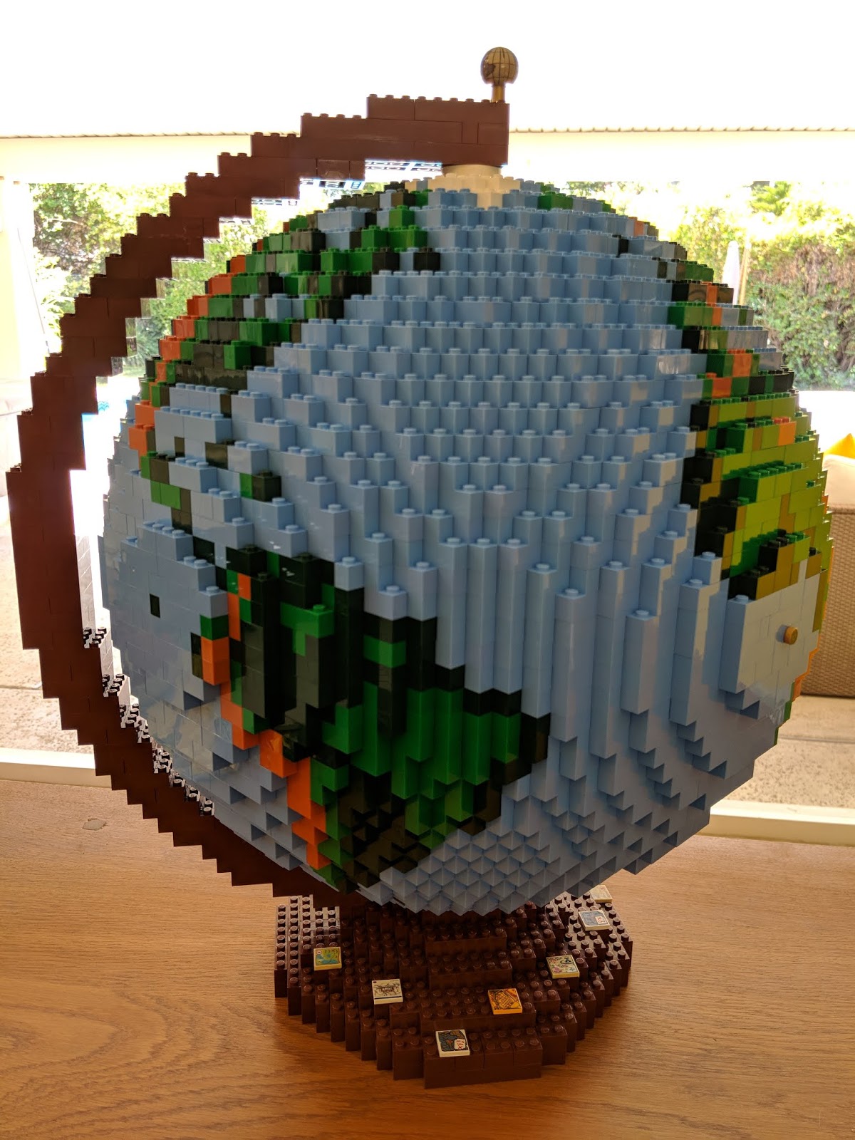
While I like the kits I can buy and I can easily follow instructions I’m no master builder so I was delighted when I eventually found a German guy called Dirk who had not only designed a globe (and a flat world map as it happens) but, he also sells the plans at a very modest price. Once you’ve got the plans you set about buying the bricks from second hand online brick markets. Fascinating to even learn that there are thousands of people who have online stores trading in Lego bricks. I sourced the bricks from over 60 different sellers from around 10 different countries. The postie did wonder what all the packages were (that rattled). I had some explaining to do. There’s over 3,800 pieces and it then took about 30 hours to build. It’s not glued so it’s a pretty technical build in that it can easily cave in on itself because it’s a sphere. It’s mostly hollow but for a few solid layers top and bottom. There’s a large central vertical column between the poles, and four struts coming off that at the equator so there’s some structure but it’s pretty fragile.
My colleague John Nelson and I were involved in putting together a ‘creative cartography’ display for our User Conference in San Diego in July 2018 and I offered to display the globe near the exhibit. So we were able to do a Lego-themed exhibit (while not actually mentioning the name Lego of course – too much lawyer work involved in that one!). It was a real draw and selfies of people with the globe were popping up everywhere – what’s not to like about a globe made of Lego at a conference for map geeks!? I also took it on tour to the UK Mapping Festival where it was also exhibited behind a London bus. I have a large packing case for it now so am happy to take it to various places if people want it on display. It’s just a bit of fun and huge thanks to Dirk for his original work. I pretty much just bought his kit and built a copy. It’s certainly geohip and was quite an effort to source and build but Dirk’s is the only globe I’ve found with pretty accurate cartography and map colours and that was, of course, pretty important to me. Just please don’t ask how much it cost.
Q. On top of all that you list yourself on LinkedIn as a “Professional cartonerd”. What sorts of reactions does that get?

Well it’s better than the reaction I get to my official job title of ‘Senior Cartographic Product Engineer’. I have long discussions about that at work. We all have fairly generic job titles which is fine, but not on a business card which tends to leave a quizzical frown on people’s faces. In fact, I don’t even bother with business cards and the like because it kicks off a pointless conversation. But bizarrely, I’ve never had a job where I’ve been called a cartographer. Much of what I do is part of a cartographer’s job but I write, teach, blog, make maps, do research, design stuff, comment and critique, etc. The point is that people perceive ‘cartographer’ in fairly stereotypical and narrowly defined terms. It’s often regarded as old school. You know, people hunched over light tables with pens and rulers. I once actually did that as a job for a few months work experience and vowed never to become a cartographer. To date, I’ve kept that promise to myself even though I ‘do’ cartography. Dataviz expert, data scientist, data architect, coder, etc all resonate more favourably so I tend not to pigeonhole myself as ‘cartographer’. I wrote this up as suffering a condition called Cartographic Identity Disorder a few years ago.
I was given the name ‘marauding cartonerd’ after an infamous online ‘debate’ I had many years ago with someone who had made a wholly inaccurate map that I took exception to. It had gone viral but there were some serious flaws in the map and, therefore, the argument that was presented. Of course, no-one particularly cared and the maker of the map just got a little frustrated at what he saw was a pedantic cartographer pouring cold water on his otherwise great idea. Critique is something we get taught in cartography (if you studied it, which I did). Yet I have a sense that receiving critique isn’t something many are particularly open to which is a shame because ultimately it improves your work. Anyway, the moniker stuck, I started my blog with that name as a place to offer critique in a hopefully humorous style (though British humour and sarcasm is not to everyone’s taste as I have found numerous times). And I guess adding the ‘Professional’ bit to the front gives it a bit of tongue-in-cheek self aggrandising value. I actually tried to get it on my business card at work. It was rejected outright. But it’s really just a bit of fun, not to be taken too seriously, and provokes far more interesting discussions with people I meet for the first time.
Q. Moving on to more serious projects, you recently published a book about cartography. Why? Who was it aimed at? What has the response been?
I’m glad you think the book is a bit more serious. I guess it is, but I had immense fun writing and making it too. The ‘why’ is pretty simple – I just kept being told by those closest to me that I should put my thoughts, experience and opinions down in a place that can be easily shared. I’ve amassed a whole heap of experience from some brilliant people over the years and why not make it into a book to give others a shortcut to that experience. Given there really aren’t any good comprehensive books on the subject then maybe it was time I stepped up to do the job and give back to the discipline that has given me so much. And my background of a couple of decades teaching students about cartography always left me wanting that perfect missing text to support them in their studies. Sure, there’s a few good texts but never the one I really wanted and those that I used way back in the late eighties in my degree studies have long been consigned to the history of cartography pile…though I still have many of them. Concepts rarely die. Technology simply finds a new way to harness them.
I get asked the ‘who is the book for’ question all the time because people want to naturally work out if it fits their specific needs. The get-out answer is ‘everyone and anyone who wants to make a map’ but that doesn’t sit squarely with trying to place it neatly into a traditional context. But it’s not a traditional book. It doesn’t conform to what a traditional textbook looks like yet I hope it has enough content to support its adoption as a class text or a reference. It’s not a coffee-table book either because it goes further than simply delighting the eye with map-porn. Though it is lavishly illustrated with a mix of original (2/3rd) and third-party (1/3rd) maps and illustrations – some familiar, some perhaps not so. Some obvious, some perhaps a little tangential but all brought together to show the breadth of cartographic practice and excellence in design. I think of it as a desk companion. The title has a full stop (period) after it because there’s an intent that it is set up to be THE modern text on cartography. There’s a little bit of arrogance in there but I felt I was only ever going to get one shot at writing this book and I was going to give it my absolute everything. Many books I have on my shelf are either outdated or just dry academic texts and who wants those any more? We get our information from so many sources that if you’re going to write a book then it has to be attractive in structure, content, and appearance. It has to appeal to a readership who find it tough to pull themselves away from Wikipedia as their go-to sage. Or who might even question why anyone would part with hard cash for a paper-based information product. But this was always designed to be a book. I think there’s a lot of value in having a physical product that you can flick through. There’s a certain permanence about a good book and we’ve gone way beyond a traditional design ethos to make it something both instructional but which visually delights and makes you actually want to turn the page. We thought of every spread as a separate poster that you’d want to put on your wall. Every time you turn the page you see something different and interesting.
After many many alternative straplines (including the working title of “the dog’s b*llocks of map-making” – a title that was very much loved during its authoring but which, for obvious reasons, was never going to be allowed in print) I settled on ‘a compendium of design-thinking for map-makers’. The wording is deliberate. It’s a collection of ideas, concepts and practical information. It gives people a grounding but also enough detail that they can put ideas into practice. It covers the subject broadly but with just enough depth to be useful and without getting too ‘academic’. You could probably find an entire book that covers each of the individual topics which says much about cartography more generally as it’s a vast subject. I also wanted to infuse traditional cartographic ideas and thinking with material from the wider design-world. All too often we retreat to our standard cartographic education and background and I feel this has become a division. Designers make maps. So do data scientists and newspaper graphics people. In fact, everyone makes maps yet they’re not necessarily keen on exploring cartography. The inverse is true – too often cartographers fail to acknowledge that their specialism is part of a wider world of design. So, trying to marry the two, bridge the divide and attract people from those two sides might help them learn something about the wider world of map-making. And I used the term ‘map-makers’ rather than ‘cartographers’ in the strapline because I didn’t want it to be seen as something solely for those old school cartographers. It should help relative newcomers better understand the ins and outs of cartographic concept and practice. It should also act as a guide and refresher for those of us with more experience and, perhaps, a background in cartography. Sort of a reference for those little bits of map-making that perhaps you’ve never attempted.
All in all I’ve tried not to pigeon-hole it. I know that makes it difficult to define a target audience but if I were writing an academic textbook, or a coffee-table book, or a manual that supported making maps using Esri software etc then it’d be a different beast altogether. The fact Esri have allowed me to make a book that is blatantly not advocating Esri products is a major win and I sincerely thank them for taking a leap of faith with this book. It was a tough sell internally for a long while but people are beginning to think that we should be doing more of this sort of stuff – general reference detailed guides about domains. Of course, all of the original maps in the book were made using Esri software but it’s implicit. It’s a tangential demonstration of the design capability of the software but, of course, my main motivation is to support map-makers in their endeavors whatever tools of choice they use. Better mapping all round is the aim. I was also able to persuade Esri Press to publish it in Oxford English. It just wouldn’t have sounded like me if it was written in American English but for an American publisher that was a really huge concession. Again, kudos to many people who went with my idea!
The reaction has been hugely positive. Sales have been pleasantly surprising. Quite a few were sceptical of the potential to get a good return on the huge investment that Esri Press made in supporting this project but it’s doing really well. There’s been lots of really nice reviews and comments, many from luminaries in the world of mapping. I mean, when you start your day with complimentary emails from the likes of Mark Monmonier you get a buzz that your work has found a home among many other great map books and revered authors. I was really fortunate to work with a few dozen fantastic people who contributed to the book too. I wanted different voices and experts to describe maps and ideas, so it’s not just me and my views and ideas. I think this has really helped generate interest. My favourite quote, though, was from one of my young nieces, who upon seeing a copy just before it went to the printers shrugged and simply said ‘who’s going to buy that?’. Family can always be assured to keep you grounded. It’s important. But, professionally, people do seem to like it. I walk around at work and there’s copies in offices and posters on walls and I’m hopeful that some of the content will rub off in a positive way. I’ve met people in eastern Africa who were desperate for a copy and I see tweets from all over the world of people unboxing it and posting their thoughts. I am genuinely humbled and thrilled that it’s been so warmly received. I couldn’t have done it without dozens of people though, and they all have a piece of ownership of the book. There’s a few more details about the book here and, hey, it’ll soon be Christmas. Order early. Order often 😉
Q. Life’s not all geohip projects though, even a geohipster must eat. Tell us a bit about your day job. What are you getting up to?
You mean life as a ‘Senior Cartographic Product Engineer’? Well, yes, the job pays the mortgage and buys the cheese but it’s a great job and I love working at Esri in sunny California. For a kid that wanted to be a NASA astronaut or a California Highway Patrol Officer (too much time spent watching CHiPs as a kid) then working in cartography and GIS in Cali is a dream come true. I arrived here mid-career after 20+ years as an academic in the UK. I’m colloquially referred to as the ‘resident cartographer’ in that I’m seen and used as an internal expert. I work on the development team for ArcGIS Pro but get to work in other areas (like content, ArcGIS Online etc) as needed. Day to day I help the team with ideas for making the software better or more useful for making maps. We have some really bright software engineers and developers so my role is to help shape how map authoring tools are designed based on what I know and what I learn from those that want better or new tools.
Thankfully no-one lets me anywhere near the codebase as my coding skills lapsed many many years ago. But it’s fulfilling in that I know that tens of thousands of people use the software to support their own cartographic work and I see ideas and design influences appear every year at our User Conference map gallery which I also help judge. A lot of the maps I make are done predominantly for internal purposes. Testing of the software is ongoing but a lot of tests are done using relatively small datasets. So I try and make ‘real’ maps with large-ish data sets. Often I’m trying to test the tools and software to destruction to find those naughty little bugs that you only really ever find when you try and do ‘real’ work. I also push the software to try and use it in ways it was perhaps never designed for, to derive new workflows or show people how to go beyond the defaults. To that end, I get to make maps on topics and datasets that I find interesting, and write about my maps and publish them as examples of what can be done with the software. Blogs help bring ideas to the world that people can go and experiment with. And, of course, imitation is the sincerest form of flattery so it always brings a smile to my face when I see an idea permeate across geo and turn up being used in other ways by people using different software. It’s all good as far as I’m concerned. So I also get to write, and teach workshops, research stuff, present at conferences and generally act as a spokesperson for high quality cartography. A couple of years ago my better half, the astoundingly talented Dr Linda Beale and I built a toolbox of terrain tools – just scripts that we built to allow people to create different ways of representing terrain than the usual default hillshades. It’s been downloaded nearly 20,000 times and we see evidence of their use all over the place. It’s a small example of being given the flexibility to just ‘do good work’ and share it. I’m convinced if you build decent tools, maps, and interesting cartographic styles and workflows then people will experiment and take them further. That’s definitely a really key part of the job for me – to see how others make use of the things you build. I’m currently building a set of cartogram tools too with the help of a number of people. These are the sort of things that might otherwise take ages to get into core software but which can be relatively easily built for those that want to get to work with them.

As well as Linda, I have the immense privilege of working alongside some seriously talented cartographers too. Having the likes of John Nelson, Wes Jones, Edie Punt, Bojan Savric and Nathan Shephard (and many others!) around drives us all to be innovative and find new or better ways of doing things. It also helps having experts along the hallway when you get stuck! That’s also why we developed our MOOC on Cartography, to share some of that expertise. At the time of writing we’re into our second offering and have so far got nearly 70,000 people registered. Imagine that – 70,000 people all wanting to learn a little bit about cartography. We had great fun making the videos and designing the exercises and, of course, it’s free so it’s nice to be able to do something that we can genuinely give back to the community. It’s also really pleasing that the company as a whole is happy to support ideas that, perhaps, aren’t at the absolute core of building GIS software and services. It’s a real privilege to be able to work in this way and support our general work through bringing new and different ideas to the table..
Q. Many of the (often quite lengthy) posts on your blog analyse map design. Occasionally you praise good design, but you’re also often liberal in dishing out the criticism. What’s the motivation for the blog and what sort of feedback do you get?
Yeah – I’m not very good at being brief. Sorry. As I mentioned earlier, that blog (my personal cartonerd blog) is deliberately designed to be a place for somewhat humorous takes on bad maps of all types. And there’s a lot of them about. I try and explain why certain designs, data manipulation, symbology or projections simply don’t work to support the job that the map and the map-makers claim to be doing. Really, it’s a taste test for the quality of the map because map readers in the general population are more than likely not attuned to knowing about such things. Why should they? They are busy being experts in their own sphere yet the map, as a document, is often considered to be fact. They can just as easily be fake through deliberate action or through a little slackness on the part of the map-maker, often simply through them not fully understanding their actions either. Much of this is not deliberate. So the blog simply tries to point this out, to mediate the message of a poorly designed map so people can better appreciate the ways it might be lying to them. I get far more grumpy responses than praise for pointing stuff out but that’s to be expected. No-one likes being told their map isn’t particularly good. I get critique on my work all the time but you kinda have to be able to disassociate comments about the map from a personal attack, which is never the intention. It’s always about the work. The map and its message, which I am simply pointing out is flawed as designed. So it’s intent is educational. Often, cutting out some relatively simple but commonly made mistakes would make a far better product.
So I often get seen as this grumpy, curmudgeonly middle-aged guy who just hates on maps. That’s not strictly true but that’s the focus of that particular blog and if that’s all you see of my work then I understand that impression. I am forthright. I do tell it as it is. I know that’s not always an approach that people find comfortable but I’d rather be up front and totally honest. But if people care to look a little wider they would see balance in what I do. I am also Chair of the International Cartographic Association Map Design Commission and that gives me more scope to look at the positives in maps. A couple of years ago I blogged a map a day for a year, writing up a few words on why it exhibits excellence in design and those are still online for people to explore. It’s almost the inverse of the cartonerd blog but, together, they balance each other nicely. And, of course, there’s plenty of other blogs, presentations and suchlike where I focus on what’s good in maps. I guess people like to gravitate to me poking a little fun at a bad map though. That’s ok. I’ll happily engage in debates on maps.
Q. It seems you’re not just hunched over the keyboard though, you get out on the conference circuit. Which also has its pros and cons, as you recently documented. What makes for a good geo conference in the modern age?
I am privileged in my job that part of what I do is to get out and about around the world. But you’re right, I think most conferences are getting a little tired and that’s driven by several factors. They often fall back on historical delivery models. They are often organised by people who you rarely see elsewhere so they default to what they know. There’s simply too many geo conferences! If I get handed a tote bag with flyers from vendors and sponsors I know I’m in for a pretty tedious few days. That junk usually gets dumped straight into the hotel bin though I try and simply not pick it up anymore. Conferences are historically places to meet people, network, learn, find out new stuff, and share your ideas. But all too often it’s the same people who go to the same conferences. I liken them to clubs. A certain group of like-minded people who already know they enjoy each other’s company goes to club A, and another group goes to club B, and they are very unlikely to meet each other. And in geo in particular, you have many people entering the realm from a variety of different backgrounds. Once it was only people working in hardcore mapping agencies, then the wider world of GIS brought others to the table (and new clubs emerged), now students of computer science are finding work and excitement with data that happens to have coordinates (and new clubs, often referred to as meetups, have emerged). Yet the question is, do they want to belong to these other clubs? I sense not and the evidence is they usually shun older clubs and form their own new club to be seen as fresh and relevant. And rather than these older clubs trying to find ways to get them to join in, they should be looking to change the model in ways that meets modern needs and which encourages a bit of intermingling.
It’s a little like cartography more generally. Every few years new technology comes along and disrupts practice. You can either be one of those mapping people who bemoans having to constantly re-tool, or you simply take a deep breath and learn new stuff. If I’d been the former then my career would have come to a rapid end decades ago. You have to move with the times and keep up, keep learning, not be afraid to ditch old habits and practices, or be that force of change that helps drive innovation. Too many geo conferences are stuck so far in the past that it makes taking days out of your schedule and money out of your budget a questionable activity. We meet in so many different ways now. Only this morning I had a conversation via Twitter’s DM with someone who, only a few years ago, I might only have met at a conference once a year. So the shrinking world means we have to rethink these meetings. They have to become something that people want to go to, not feel an obligation to support. It’s not impossible. I like the #geomob model of more frequent, less formal meetups. I think a lot of people gravitate to that sort of gettogether. But even at the recent UK Mapping Festival it was fascinating how few people who attended the conference during the day went to the #geomob event in the same city in the evening. Bar a few, almost completely different sets of people but which would really benefit from sharing ideas and experiences between their de facto groupings. It’s just a case of developing events at which both groups can feel comfortable and where they see value. Otherwise the groups become self-selecting and self-organising rather than offering proper outreach and events that drives mutually inclusive rather than mutually exclusive activities.
There are too many geo societies and groups in the UK though. It’s fragmented and, so, that drives the divisions through different club mentalities and events. I have no magic solution but I do suggest people look at models that are used elsewhere for inspiration. I’m a big fan of the North American Cartographic Information Society (NACIS) conference. It’s annual. It travels to different US cities, often second tier cities like Boulder CO, or Norfolk VA to avoid the costs associated with the major cities. And they have a programme that attracts a really diverse crowd. You have the GISers mixing with the Adobe fans. You have decade old cartographers mixing with artists, designers and coders. You have the Esri crowd mixing with those from Mapbox, CARTO and others. You have map publishers like National Geographic in attendance alongside those that work for the New York Times and the Washington Post for instance. People from totally different backgrounds and with different workflows and needs. The key connecting factor is the map. Everyone is there because they are interested in maps. No angst. No tribal tendencies. Just a shared passion and good conversations. But when I go to FOSS4G I still sense some tribal BS. When I attend the more traditional mapping conferences in the UK I still see out-moded organisation and people wondering why new folks aren’t there. It can be different and the NACIS model somehow manages to stay ahead of the curve.
I’d like to see modern geo-events be fewer and more inclusive. Different tracks and content that attracts a diverse range of people who are interested in, work in, or simply have a fascination for maps, geo, GIS, however they frame it. Such an event shouldn’t be directly linked to a particular society or club mentality. It needs to bring together different communities and be marketed at those communities in ways that gives them a real reason to attend. And that might be through different strategies for different communities. I’m not saying for one minute that this is easy. If it were, I’m quite convinced people would already be working towards it. But, instead of tinkering with models that we’ve relied on for years, perhaps ripping up the template and trying to find something fresh is what’s needed. After all, the entire purpose of a conference is to get together, share and learn. That contact between people during a talk or in the bar in the evening is often so fruitful. New relationships emerge and new ideas form. I’ve relied on conferences throughout my career to support my own lifelong learning. They help keep my work relevant and they have led to so many wonderful experiences and the development of a terrific network of colleagues, many of whom I now count as some of my closest friends. It’d be a shame if future geo-people don’t have an opportunity to do these things just because they feel that events aren’t relevant any more. We have to drive to make them relevant.
Take the #geocheese as a perfect example. If I hadn’t seen Chris’ biscuit map hanging on the wall at a conference last year I may never had got the spark for a map of cheese. And because of the map of cheese, I was invited to answer some questions for this GeoHipster blog. These opportunities sometimes happen by design but, more often than not, they’re serendipitous. You learn stuff, hone an new idea, execute it, and new opportunities emerge as a result. Take the Cartography book as another example. Because it’s doing well I’ve been able to pitch another book idea and get support. Nothing quite as grandiose this time but a useful book nevertheless. I’m looking forward to really getting going on this in the latter part of this year and early 2019.
Q: What closing advice do you have for all the geohipsters out there?
I’m probably the last person to be giving advice to budding geohipsters. Just do what you love doing. Find a way to make your voice heard and own your work by putting your name to it. It builds respect and, eventually, authority. Don’t get too caught up in any hyperbole that might come with your work and take critique in a positive fashion, never personally. Learn from the past and what people have found is best practice from decades of learning and figuring it out – but don’t be afraid to bend a few rules once you’ve learnt how they can be bent meaningfully. Understand that very little is actually new any more so build on what’s gone before rather than always trying to reinvent. Cite your sources and inspirations. Be humble in your work but find ways to enjoy what you do. If it’s worth doing, it’s worth doing right. We live a geo-lifestyle. It’s hard to detach the profession from personal interest. Also, look beyond your own sphere. I found so much out during the process of writing my book. I mean, who ever imagined they’d read a quote from Bruce Lee in a book on Cartography but once I’d seen it it had to go in. I think it’s a perfect way of capturing the essence of being in geo, whether you’re a middle-aged geo-hippy-hipster like me or someone a little newer to the mapping game: “Adapt what is useful, reject what is useless, and add what is specifically your own.” Enjoy Lego if that takes your fancy. If not, eat some cheese!