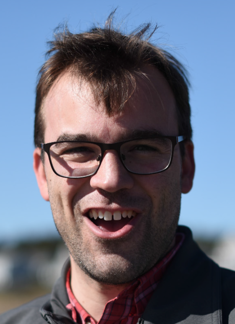
Tim Wallace is a Graphics Editor and geographer for The New York Times, where he makes visual stories with information gathered from from land, sky and space. He has a Ph.D. in Geography from the University of Wisconsin-Madison.
Tim was interviewed for GeoHipster by Amy Smith.
Q: How did you get into mapping?
A: I’ve always been into maps and geography. I grew up outside of Boston in a family that took one kind of vacation—road trips to go camping. We drove everywhere we could in the Northeast: Vermont, New Hampshire and Maine, of course, but also New Brunswick, Nova Scotia and even Newfoundland (my favorite). For me, as an elementary school kid and middle schooler, it was pretty spectacular seeing all those beautiful landscapes in person, as well as discovering how they all were connected thanks to the maps we collected along the way.
While my first job (at the age of 8) was in journalism (I was a paperboy for the Boston Globe, of course!), the realization that I could have a career in journalism came much later, after a few years as an aspiring maritime archaeologist. I’d gotten both my undergraduate and masters degrees in archaeology, but after realizing the thrill of diving on a wreck was an opportunity I’d only experience rarely, I found myself drawn to the kinds of storytelling and visual explanation that are crucial to the preservation of cultural heritage. I was already doing a lot of cartography as an archaeologist, but without a great deal of formal training, I felt like I was winging it more than I wanted to be. So I decided to go for a PhD in geography.
Q: The title of your thesis is “Cartographic Journalism: Situating Modern News Mapping in a History of Map-User Interaction”. It was published in 2016, but you’ve been at the New York Times since 2012… so you completed a PhD while working at the NYT? That sounds impossible – how did you manage to pull it off?
A: Oh, boy. Short answer: writing retreats and sticking to a strict schedule. Long answer: It wasn’t easy, and I didn’t do it alone. Once I’d started at The Times, many people asked me why I would bother finishing. And as time passed, doubt crept in that I was even capable of it. In fact, I don’t think I would have finished if I hadn’t had the support of my wife, Kelly, and family, who understood on a deeply personal level what finishing might mean to me. I don’t talk about it much (because really there’s no point), but I struggled with dyslexia and short term memory issues as a kid—so much that one teacher told my folks that I would never be able to go to college. So, if I’m being honest, a good percentage of my drive to finish was thanks to family support—and also the desire to stick it to those long-since-gone teachers and prove to myself that I’m every bit as capable as the next geographic nerdlinger. Take that, Mrs. Baldwin! Hahaaa!
Q: You started off as an intern for the New York Times, but now you work as a graphics editor. What’s that like? Can you walk us through a typical day?
A: One of the greatest things about my job is that when I wake up in the morning, I often have no clue what I’ll be working on that day. Breaking news, fresh assignments or successful pitches often turn any expectations of how a day (or even a week) might go, upside down. Having said that, there are a handful of things that I often do (even if I don’t know when I’ll be doing them). I make maps, solo or along with a handful of other geographers in the department, and those same geographers and I assist other colleagues with mapmaking. I work with satellite imagery quite a lot, and increasingly, various types of drone imagery. Sometimes that drone imagery comes from flights that I or my colleagues have piloted. Occasionally I find myself working alone, but our department, and the newsroom as a whole, is extremely collaborative. So it’s pretty rare that the work I do isn’t done in support of a team effort.
Q: You work with a wide range of data types, from satellite imagery to spatially referenced data, and not so spatially referenced data. Can you tell us about the tools that you use?
A: Our department has a handful of internally-built tools (some of which have been opened to the public, like ai2html!), but everyone works with their own little hodgepodge of tools that suit their pace and type of work. For short deadlines (sometimes only minutes), we keep it simple (often only using illustrator and/or photoshop); for enterprise stuff we often have time to get a little experimental and try new tools and techniques. Geospatial tools I use include GDAL (my bash profile is a mess with functions for common tasks, like cleaning up gross shapefiles or pansharpening Landsat imagery), Mapshaper (made by my colleague, Matthew Bloch!), Arc/Q GIS (am I allowed to list them interchangeably like that?), GeographicImager, MAPublisher—but I’ll dabble in ENVI or Pix4D if I have time! Because of our often-frantic work pace, our spatial database management is borderline atrocious though. So, please don’t ask me about that. 🙁
Q: How often do you get to experiment, try out a new tool or a different approach to a problem?
A: Every story is at least little different from any other, so some level of experimentation is a part of the job. Dedicated whacky experimentation time usually only happens when we know a story is coming that we want to cover very differently. But I work with a group of creative people who are always pushing to do better work with new and surprising techniques, so some days feel almost like I’m in a little R&D graphics lab.
Q: This past October, you worked on the New York Times’ story How California’s Most Destructive Wildfire Spread, Hour by Hour. For just two hundred words and one map, it communicates a wealth of information. How did you achieve the brief yet comprehensive final product?
A: The Tubbs fire was unique for several reasons, but chief among them was the unusual rate at which it moved down a hill and into a populated area. We felt pretty strongly that this needed to be explained visually to give our readers the best sense of what happened. Projects like this are big team efforts. Derek Watkins was reporting from California for the first part of the production of the graphic. Others of us back in New York were helping delineate the fire’s perimeter using the latest data from the state, images from the European Space Agency, Landsat and DigitalGlobe. We were also using the DigitalGlobe imagery to determine which buildings were destroyed. If we weren’t sure about a building and Derek had access, he would go take a look and we would update our map with what he found. The locations of deaths were mapped with old-fashioned reporting. The timeline was put together using VIIRS, MODIS and GOES-16 data and we tried our best not to imply any more precision than we had. You may notice the lines aren’t sharp, for example. Their gradient is meant to visually display the fuzziness of the precision of our timeline based on our amalgam of sources.
Q: Is it normal for news publications to employ top notch geographers, or is that something unique to the New York Times?
A: What it means to be a Geographer in a newsroom and what we do has changed over time, but we’ve always been around. Maps have appeared in newsprint for centuries and many reporters do geography all the time! The type of work we’re doing now though feels special, like we’ve hit an inflection point where institutions are leaning on Geographers not just for maps or square mile calculations, but also for their perspective on news events as they happen across cultures and landscapes.
Q: Many people I’ve talked to who make maps professionally often make maps in their spare time for fun. Do you have any fun mapping projects in the works?
A: I’ve made a habit of putting myself to sleep at night with satellite imagery instead of a long read. I sometimes tinker with ideas too, but I’ve found that it’s pretty important to step back a little from my work during certain hours so that I don’t burn out!
Q: You also run a website called Bostonography with Andy Woodruff. For those who might not know, what is Bostonography? How did it come about?
A: Andy approached me about it at NACIS in St. Petersburg in 2010. He’d just moved to Boston and I’d just left. So, with his fresh eyes and my perspective as a recent Bostonian, it made good sense to team up. And it has been a lot of fun pretending to be the modern day Kevin Lynches of Boston. I just wish we had more time for it!
Side note: Amy’s favorite on the site is Whoops: Dunkin’s are Closer, which is a correction of an earlier Bostonography map showing distances to the nearest Dunkin’ Donuts across Boston. The farthest place in Boston from a Dunkin’ Donuts appears to be a cemetery, which you point out is ironic, because there’s another great Bostography map showing distance to cemeteries.
Q: What do you do for fun? Any hobbies? Your website has a lovely photo of your writing coach, who looks like a lot of fun…
A: I really don’t think I could enjoy spending time with Kelly, my son and my dog, Lucy, any more than I do. We cherish the weekends when we can stretch out our walks in the park, build worlds out of train tracks, hit up the zoo or go for a swim. I love taking photos and experimenting with photography too. I bake and cook a lot. Oh, and I might make a map here or there for fun (like this housewarming gift for my parents).
Q: Are you a geohipster? Why or why not?
A: Why, sure! I’m a geographer living in Brooklyn, I make my own pickles and babka, and I collect old maps. I should at least be geohipster-adjacent with these qualifications, right?
Q: Any words of wisdom you’d like to leave with the geohipster community?
A: Be friendly, share your knowledge and try to get the whole picture before you criticize. We all work differently and have a lot to learn from one another.